Stocks’ Death Cross Is Another Overblown Fear
An ominous event in the S&P 500 likely will happen soon, but reports of the market’s death are exaggerated


Profit and prosper with the best of Kiplinger's advice on investing, taxes, retirement, personal finance and much more. Delivered daily. Enter your email in the box and click Sign Me Up.
You are now subscribed
Your newsletter sign-up was successful
Want to add more newsletters?

Delivered daily
Kiplinger Today
Profit and prosper with the best of Kiplinger's advice on investing, taxes, retirement, personal finance and much more delivered daily. Smart money moves start here.

Sent five days a week
Kiplinger A Step Ahead
Get practical help to make better financial decisions in your everyday life, from spending to savings on top deals.

Delivered daily
Kiplinger Closing Bell
Get today's biggest financial and investing headlines delivered to your inbox every day the U.S. stock market is open.

Sent twice a week
Kiplinger Adviser Intel
Financial pros across the country share best practices and fresh tactics to preserve and grow your wealth.

Delivered weekly
Kiplinger Tax Tips
Trim your federal and state tax bills with practical tax-planning and tax-cutting strategies.

Sent twice a week
Kiplinger Retirement Tips
Your twice-a-week guide to planning and enjoying a financially secure and richly rewarding retirement

Sent bimonthly.
Kiplinger Adviser Angle
Insights for advisers, wealth managers and other financial professionals.

Sent twice a week
Kiplinger Investing Weekly
Your twice-a-week roundup of promising stocks, funds, companies and industries you should consider, ones you should avoid, and why.

Sent weekly for six weeks
Kiplinger Invest for Retirement
Your step-by-step six-part series on how to invest for retirement, from devising a successful strategy to exactly which investments to choose.
Pundits are no doubt sharpening their pencils over the prospect that the Standard & Poor’s 500-stock index is about to form a technical pattern called a “death cross.” And a death cross, as the name would suggest, should be quite deadly for stocks.
But is it?
The problem is that death crosses are quite unreliable signals in the stock market. Sometimes they do forecast a major selloff ahead. But other times they actually mark good buy signals.
From just $107.88 $24.99 for Kiplinger Personal Finance
Become a smarter, better informed investor. Subscribe from just $107.88 $24.99, plus get up to 4 Special Issues

Sign up for Kiplinger’s Free Newsletters
Profit and prosper with the best of expert advice on investing, taxes, retirement, personal finance and more - straight to your e-mail.
Profit and prosper with the best of expert advice - straight to your e-mail.
What’s a Death Cross?
A death cross occurs when a shorter-term moving average (more on that in a second) crosses, or moves below, a longer-term moving average. Put another way, it is when a short trend heads lower while a longer trend is still heading higher.
As with all signals in the stock market (and in life), the short-term condition always reacts faster to external stimuli than the long-term condition. The idea is that it gives investors an early warning signal that a bull market is gone and a bear market is beginning.
A moving average is a technical tool that investors use in conjunction with charts. While there are many variations on their construction, the basic idea is to find an average value for the underlying stock or index over a desired period of time. If the current price for the stock or index is above the average price, then the market is bullish, and vice versa.
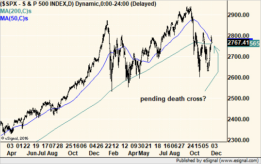
The average “moves” over time as the window for the data used in the calculations shifts forward each period. For example, in a 50-day moving average, the calculation uses data from the past 50 days. The next day, it starts fresh and samples data from 50 days back from that day.
Each day has its own value for the average price. If that average value moves higher over time, it becomes a proxy for a rising or bullish trend in the market. If it moves lower over time, then the trend is falling or bearish.
Chartists look at the interplay of two moving averages to add an extra dimension to the analysis. Crossovers between the two are supposed to signal important changes in the trend.
For whatever reason – whether it was deliberate study of parameter selection or laziness in using the default settings in their software – chartists settled into 50- and 200-day moving averages as the standard for a death crosses, also known as black crosses. The converse version of the pattern, called a “golden cross,” also uses the same pair of averages and signals bullishness when the 50-day crosses above the 200-day.
But Does It Work?
Historically, death crosses have signaled pending bear markets and continued to keep investors out of the market as prices fell. However, they have not been not so good with corrections.
The problem? We can’t know if a decline is a correction or a bear market as it begins. Therefore, death crosses prove valuable only some of the time.
Why, then, are we so enamored with the signal? Is it just the name that keeps us interested?
More likely, it is the belief that one event will actually “ring the bell” and forecast the market for us.
It is easy to see that when the signal works, it really works. It triggered reliable sell signals at the end of the Internet bubble in 2000, just ahead of the financial crisis in 2008, and it sure looks as if the pending cross in 2018 after a long bull run will be just as good.
Conversely, golden crosses in 1982, 2003 and 2009 at the beginning of respective bull markets are still strong in investor memories.
But what we all collectively forget is the number of times these signals did not work. For example, in 1987, the death cross happened on Nov. 5, 14 trading days after the crash and 16 days after the initial technical breakdown. In more recent, and less dramatic, examples, death crosses formed after the bulk of corrections in 2010 and 2011 occurred, and just about when the S&P 500 was at its lows. Buying, not selling, would have produced substantial gains within weeks of the signal.
That’s because averages, by their very nature, are lagging indicators. They use data from the recent past. The longer the average, the farther back in time its data. That is why analysts use two averages to follow the interplay of short- and long-term trends to create more current signals.
Perhaps a pair of shorter-term averages might have differentiated between these corrections and bear markets. After all, corrections are shorter-term moves than bear markets.
Most of the Market Already Crossed
While everyone obsesses over the pending death cross in the S&P 500, they seem to have missed the fact that the S&P MidCap 400 Index of mid-capitalization stocks, the Russell 2000 Index of small-cap stocks and the New York Stock Exchange Composite Index all crossed in mid-November. Both the key bank and semiconductor sectors crossed in October. And the overall market is still standing.
Is that a testament to the resilience in the big stocks of the S&P 500? Or rather that the stock market is so diverse with so many ways to slice and dice it that conflicting signals are not just possible, but likely?
We should not rely on one isolated event to determine our investment stance. Understand what the crossover of two averages means, but make it but one part of your investment strategy.
If the short-term average is above the long-term, the odds that a portfolio will perform as expected is higher. And when the short average is below the long average, more caution is warranted; only the fittest companies should be on your radar screen.
This is not to say that the economy cannot sour, trade talks break down or interest rates skyrocket, which can cause the next bear market. But we can cross that bridge when we come to it. Chances are the charts will offer additional clues about the pending decline at the same time to confirm the changes that may be ahead.
Profit and prosper with the best of Kiplinger's advice on investing, taxes, retirement, personal finance and much more. Delivered daily. Enter your email in the box and click Sign Me Up.

-
 Dow Adds 1,206 Points to Top 50,000: Stock Market Today
The S&P 500 and Nasdaq also had strong finishes to a volatile week, with beaten-down tech stocks outperforming.
-
 Ask the Tax Editor: Federal Income Tax Deductions
Ask the Editor In this week's Ask the Editor Q&A, Joy Taylor answers questions on federal income tax deductions
-
 States With No-Fault Car Insurance Laws (and How No-Fault Car Insurance Works)
A breakdown of the confusing rules around no-fault car insurance in every state where it exists.
-
 If You'd Put $1,000 Into AMD Stock 20 Years Ago, Here's What You'd Have Today
Advanced Micro Devices stock is soaring thanks to AI, but as a buy-and-hold bet, it's been a market laggard.
-
 If You'd Put $1,000 Into UPS Stock 20 Years Ago, Here's What You'd Have Today
United Parcel Service stock has been a massive long-term laggard.
-
 If You'd Put $1,000 Into Lowe's Stock 20 Years Ago, Here's What You'd Have Today
Lowe's stock has delivered disappointing returns recently, but it's been a great holding for truly patient investors.
-
 If You'd Put $1,000 Into 3M Stock 20 Years Ago, Here's What You'd Have Today
MMM stock has been a pit of despair for truly long-term shareholders.
-
 If You'd Put $1,000 Into Coca-Cola Stock 20 Years Ago, Here's What You'd Have Today
Even with its reliable dividend growth and generous stock buybacks, Coca-Cola has underperformed the broad market in the long term.
-
 If You Put $1,000 into Qualcomm Stock 20 Years Ago, Here's What You Would Have Today
Qualcomm stock has been a big disappointment for truly long-term investors.
-
 If You'd Put $1,000 Into Home Depot Stock 20 Years Ago, Here's What You'd Have Today
Home Depot stock has been a buy-and-hold banger for truly long-term investors.
-
 If You'd Put $1,000 Into Bank of America Stock 20 Years Ago, Here's What You'd Have Today
Bank of America stock has been a massive buy-and-hold bust.